Hey everyone, I’m Kelly, and today I’m going to share nine things that you should remove from your website immediately to get your visitor to stick around for longer and improve your conversions.
There are things on your website that are making it look dated and are sabotaging your conversions and your SEO.
1. Sliders
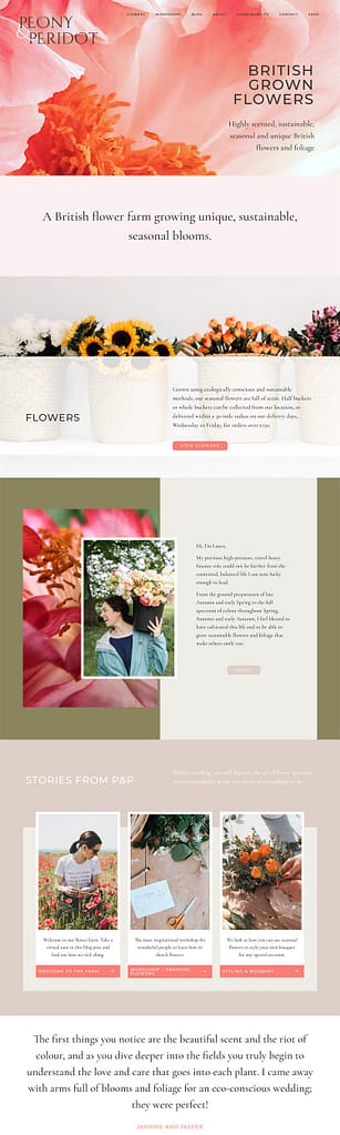
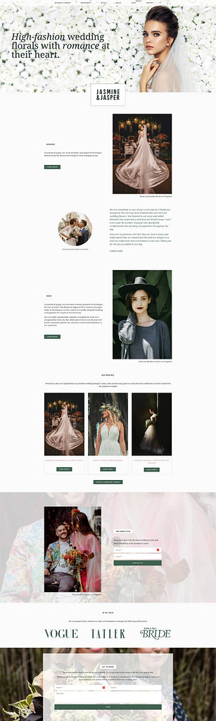
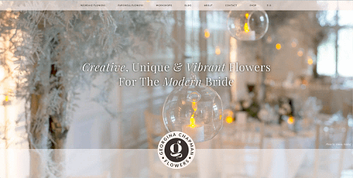
The first thing to remove are any sliders you have on your website. Sliders were really trendy a few years back, but now they instantly make your page look dated and they make your visitor have to make a decision really quickly. You’ve got all this stuff flying at them, all this information, and they have to choose what they want to do. However, you can choose for them – think about what is most important on your website and put a large image with some text over it and a button which leads them to that. It is going to be far more effective than the slider at converting your visitor into a client.
Another reason to get rid of sliders is they are generally quite large images, full-width images, and as a result take time to load on your website. This can slow down your site, which is bad for your visitors’ experience and also for SEO.
2. Clutter
Number two, remove any clutter from your website. A cluttered website screams “I’m outdated”, and it confuses your user. Take a look at everything you’ve got on there. Have you got multiple images that say the same thing? Could you just replace all of those with one? What about your text? Are you saying the same thing multiple times? Are there too many words in there? Is your text bloated? Could you get the same message across in a shorter paragraph, with fewer words? I use a great writing tool called Grammarly for this, which is a lifesaver, and it’s improved my writing no end. Fewer, more powerful words will make a massive difference to your website.
3. Submenus
Number three, remove submenus from your navigation. Unless you are a massive resource like a university, or you’ve got tons of products and you need to have different categories to make it easier for users to navigate your website, you probably don’t need sub-navigation, or a dropdown list.
I see this a lot for ‘Services’, for example, someone might only have four things in their menu, they’ve got loads of space there, but they’re still put ‘Services’ as a top level menu selection and you have to click onto it to see which services are available. That means the user has to make two clicks to find what they’re looking for.
Say for example, you’re a florist and you do wedding flowers and you’ve got ‘Services’, and then you have a drop down that says ‘Wedding Flowers and Events’. You’ve just got those two things in there. They’ve had to click twice to get to the ‘Wedding Flowers’ page or the ‘Events’ page, whereas if they were just items in the menu, it would be much easier for your user. Also, make sure any links in your website are clear, straightforward and easy to understand. Choose common names like ‘About’ and ‘Contact’, where possible.
4. Unoptimized images
Number four, remove any unoptimized images. Large images are going to take a long time to load and will dramatically slow down your website and affect SEO. Images that are too small or resized incorrectly are going to look blurred and make your website look dated, and so are equally going to affect your website. You should resize each image to fit the container that it’s in on the website, so if your container’s 200 x 200 pixels, you don’t need a massive 3,000-wide pixel image to go in there, it needs to be resized to 200 pixels by 200 pixels.
You can also use a plugin to help with your image optimization, and I have a whole video on this topic, so if you feel this is something your website is suffering from, or you’re not clear on what I mean by this, then please head over to that video after you’ve watched this one.
5. Text
Number five, remove text from images. I see a lot of websites where images have been saved with text over them. For example, someone’s created an image from a template in Canva, and then they’re uploading that to their website (a quote, for example), but the issue with this is that; one, a screen reader can’t read it because the text is inside the image and two, a search engine can’t read it, so no one can read it unless you can physically see the page.
The other issue is responsive design – if you’ve uploaded an image with text over it, then that means once your screen is resized, say, for example, to a tiny mobile, people might not be able to read that text anymore, or even worse, it’s shoved off to the left-hand side and not visible at all. Your user is left thinking, “What is going on here? Why is it just a random half-image here?” If you’re struggling, then you can use a page builder like Elementor, which makes this super easy, as what you want is your images as a background, and you want the text overlaid onto it.
6. Social icons
Number six, remove your social icons from your header – this could be quite controversial! I know a lot of people have their social icons in your header, but it’s quite hard to get people to your website in the first place, so the last thing you want to do when you finally got them there is send them back down a social media rabbit hole.
I’m not saying there isn’t a place for social media icons on your website, but that should be in your footer, that’s where I like to put them, so it’s on every page. At least then they’ve got to the bottom of the page and now they can make a decision. If they want to go and follow you on social media, then that’s better than nothing, but having them right at the top means you might lose your visitor before you’ve even got them to look around.
Keeping people on your website for longer is great, because then they’re going to learn more about you, and it’s also great for SEO because the longer they stay on there, the lower this thing called bounce rate is, and search engines love a low bounce rate.
7. Dates on Blog posts
Number seven, remove dates from your blog posts. On the majority of websites, the date of the blog post is irrelevant. For example, I’m going to turn this video into a post on my website, but it doesn’t matter that I created it today or if I did it last year, that information is evergreen and it’s still relevant a year from now.
If something changes, I might edit it and I might edit my video, but it’s still the same blog post, so it doesn’t matter what date it was originally. If I had a date on the post, and I had some time off, and people visited the site, they might think it strange I hadn’t created a blog post for a year. That makes your blog feel outdated, even if the data in the blog post is very relevant. So remove the dates and then it avoids confusion and stops people thinking I’m going to go and find a newer blog post to read on this subject.
8. Email address
Number eight, remove your email address. If a visitor clicks on your email address and it’s a ‘mailto’ link, it can potentially lead to big issues. For example, it might open in the wrong email program and confuse them or, worse still, they go ahead and send you a message, but it might not get sent because that email program is not connected or set up.
Another issue with having your email address on your website is that bots can scrape it, which is going to lead to you getting lots of spam. Also, on a WordPress website for example, if your username is your actual email address, the same email address you’ve got on your website, you’re giving a hacker half your username and password combination and that’s not a good idea either. Instead of using an email address, you need to use a contact form, which is going to look much more professional, and it enables your visitor to get in touch without leaving your website and the possibility of being distracted by their inbox.
9. Fussy forms
Finally, number nine, keep your contact forms very simple, only ask for vital information. For example, a visitor may be uncomfortable giving you their home address if they only want to ask you about one of your products, and asking them for it may stop them from filling in the form altogether. You only need a few simple fields like name, email, and message, and a nice button that entices people to fill in the form and click ‘Send’.
If you do need more than that for your business purposes, then ensure the first contact doesn’t have to be all that. For example, if you need someone to fill in a medical questionnaire, don’t get them to do that the first time they’re getting in touch, do it after they’ve filled in the form and they’ve agreed to sign up, then send them the long-winded forms they have to fill in for legal reasons.